Music Selected by Humans for Humans
Conduit was created to help people discover the music they didn’t know they love. Their curators know from experience that you can fall in love with a song, an artist, an entire genre even, that is unrelated to anything you listen to now. They trust that listeners have a thirsty ear, and are ready to hear in technicolor. Their curation crew is happy to let other algorithm-driven services play today's hits. They'd rather help people find what they didn't realize they’d been looking for.
LOGO & VISUAL IDENTITY DESIGN | app UX & design
Human • Vibrant • Off-the-beaten-path
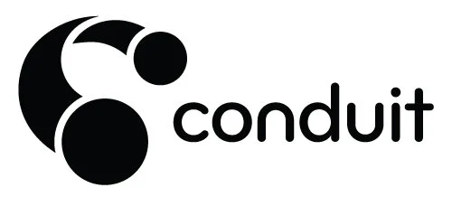
The Conduit logo is comprised of three symbols: the letter “C”, headphones, and a portal. The perspective of the icon evokes dynamism and dimensionality. As a whole, the symbol expresses the way curators transport listeners and disseminate new music via Conduit. The color palette expresses eclecticism, vibrancy, and a sense of the unexpected. The inclusion of both earthy and electric hues speak to the dynamic range of curators’ tastes. High contrast black and white photography underscores Conduit’s raw and real approach, and to unify the varied quality of portraits provided by curators. Sets are defined with abstract illustration suggestive of their hand-made nature.
“I’ve had the genuine pleasure of working with Amy Hayes for over 25 years, first as a co-worker, then as her client. In all that time, Amy has delivered not only top quality design work, but intuitive and incisive insight into my business’ branding, marketing and overall approach. After four launches (and counting), working with Amy is one of my most favorite and valuable parts of the process. She’s indispensable.”
– Joel Davis, Minister of Music (among other things)


