Never a Bland Moment
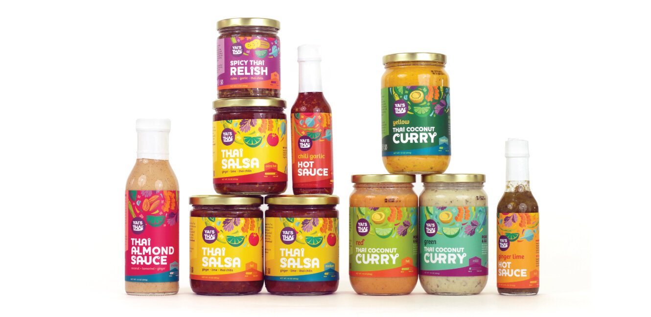
Yai’s Thai is a fast-growing line of salsas, relishes, and sauces featuring recipes from the co-founder’s fiery Yai (Thai for “grandma”). Their products are made with simple, clean ingredients and fresh Thai flavors combined with a bit of American soul. Since rebranding and launching this updated packaging (designed as a part of the team at Vermilion with Co-Art Direction - Karen Chin; Design & Illustration - Molly Clark), the brand has seen over and 300% increase in points of distribution, 250% revenue increase and 400% increase in website traffic.
CREATIVE PLATFORM DEVELOPMENT | PACKAGING DESIGN | ILLUSTRATION
PHASE 1 > DISCOVERY
The assignment: enliven the asian foods aisle with the spirit of adventure
Yai’s Thai offers bold Thai flavors with American soul for everyday foods that are deliciously fresh, zing-y, and adventurous. The mood board for Yai’s packaging update shows equally adventurous color and textural inspiration from Bangkok’s vibrant Kao San road and Thai textiles. Layout elements echo Thai architectural themes, and the typography borrows the looped terminals seen in traditional Thai calligraphy. Stylized ingredients illustrations offer a contemporary sensibility.
PHASE 2 > DESIGN
Getting the most out of every moment,
and every bite
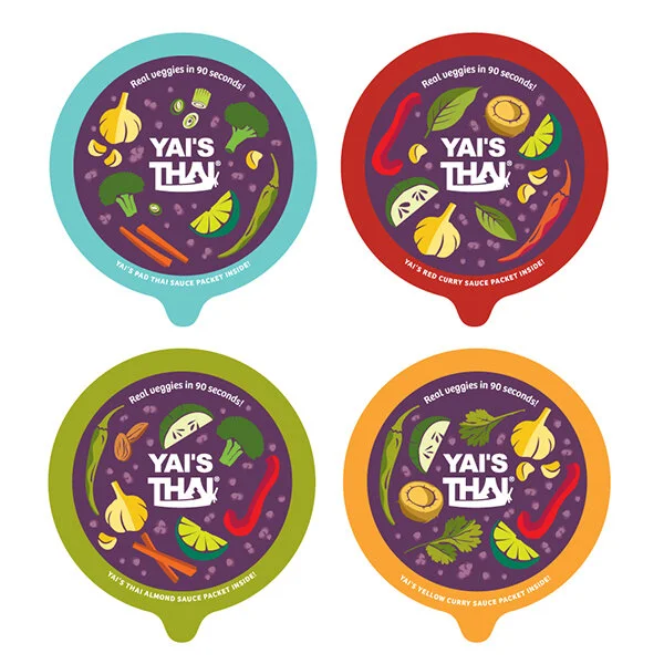
After the full packaging rollout, we were tasked with the packaging for this product innovation — a set of healthy grab-and-go bowls. To create a stronger brand statement, we set the logo free from its purple circle, and instead integrated the logo and veggie illustrations into a strong, recognizable purple banner to appear across product lines. The peaked Thai roof remained as a strong graphic element to contain the flavor names.


